How Can I Increase Revenue with My eCommerce?
If you have an online shop, you’ve probably asked yourself this question, right? You spend thousands of euros on marketing and advertising, you see an increase in visits, but sales don’t go up. Why is that? Cart abandonment is a real issue for eCommerce, with a study showing that 69.23% of users leave the site during the purchase process. This means that for every 100 users who add a product to their cart, 69 don’t complete the purchase. That’s why we need to talk about Mobile eCommerce.
With the help of Mobile User Experience, you can reduce abandonment on your eCommerce site and increase purchases. In this article, I want to explain what sets the best mobile eCommerce experiences apart from standard ones.
First of all, though, you need to understand what user experience means.
User experience is the overall experience of users visiting your online store.
In other words, it’s the harmony that combines the ease of finding the product they want to purchase with a smooth buying process, free of unpleasant surprises (e.g., errors or unexpected costs). Unlike the user interface (UI), better known as the ‘graphic interface,’ user experience (UX) isn’t something you ‘see’ but rather ‘feel.’ It’s based on research and testing, but above all, it puts the user at the center.
A negative mobile user experience leads users to leave your site, and it leaves a negative impression of your brand overall.
Optimizing the mobile user experience of your eCommerce site isn’t optional; it’s a must.
As research from Google shows, a positive overall experience can turn visitors to your eCommerce site into potential customers, increasing your revenue. Conversely, with thousands of alternatives available, they won’t hesitate to go elsewhere—and very quickly!
How Can We Optimize the Mobile User Experience of Your eCommerce Site?
In reality, there is no specific rule to apply to all eCommerce sites, but there are some guidelines to help users achieve their goals:
- Allow users to understand the type of site from the page content. It may seem trivial, but 42% of eCommerce sites don’t do this!
When users (new or with little previous experience on your site) arrive on a page, they quickly scan it to get, based on the content, a ‘feeling’ for the site.
Unfortunately, this scan can often mislead users and lead them to wrongly assume the scope of the site’s product catalog—either because too little content is available or, more commonly, because the displayed content isn’t sufficiently diversified.
Notice how it’s not particularly clear from scanning this homepage that you can buy health products and furniture
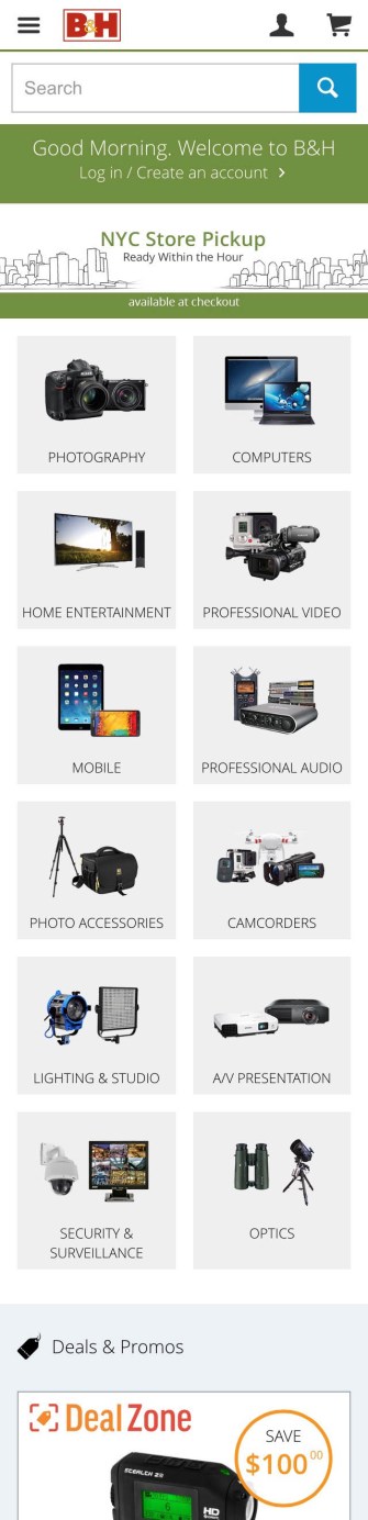
On this homepage, all the categories are immediately visible, accompanied by a preview image.
By scanning this eCommerce site, the user immediately gets a complete view of the product catalog, helping them quickly find the product they are looking for. Notice how the preview image includes 2/3 products to show the user what they can expect to find inside.
- Integrating Thematic or Guided Navigation
34% of mobile eCommerce sites don’t offer thematic search, leaving out users who are used to searching for products by theme, such as ‘casual men’s shoes,’ ‘portrait camera,’ ‘summer jacket,’ etc.
Thematic navigation doesn’t necessarily have to consist of ‘traditional’ product categories.
It can also be a sort of ‘product guide’ or a ‘search’ that helps the user find the right product through a series of thematic criteria.
Even blog posts can serve as thematic navigation.
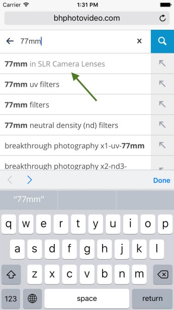
- Allowing Users to Search ‘Within’ a Selected Category
A study by the Baymard Institute found that over 50% of mobile users use the search field (if available) to filter products within a selected product category.
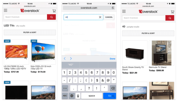
Most users who first navigated through a category, like ‘TV’ (first image), would then attempt to search using queries like ’40,’ thinking this would narrow the search to 40-inch TVs (in the center). However, since the site performs a global search, this behavior will provide users with a list of highly irrelevant results
Most likely, the user won’t find the product and will abandon the site.
However, thanks to mobile user experience (research and testing), we can identify the problem and find a possible solution: suggesting the path the user is currently navigating in the autocomplete suggestions.
Here, the currently navigated path is shown in the autocomplete suggestions with the current category.
Thanks to this ‘small’ change, your user will be able to find the product they were looking for and proceed with their goal.
This demonstrates how important it is to include user experience from the beginning to identify those ‘small’ details that truly make the difference between a standard eCommerce site and a mobile user experience that puts the user at the center.
- Clearly Distinguish the ‘Click’ Area on a Product List
An important mobile interaction detail is to clearly indicate the ‘clickable’ area in a product list with multiple interactive elements, or alternatively, apply the ‘tap’ to the entire product area in the list.
If the user is unsure where to tap to select a specific action in a list, they won’t be able to proceed and will consequently abandon the site.
Here, the currently navigated path is shown in the autocomplete suggestions with the current category
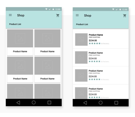
Here, the clickable area for each product in the list is very clear
- For every field the user needs to fill out, use the correct keyboard.
Filling out fields on mobile can be time-consuming and prone to errors.
By reducing the total number of fields and auto-filling fields for the user (based on the system’s knowledge of that particular user), the mobile user experience can be greatly simplified.
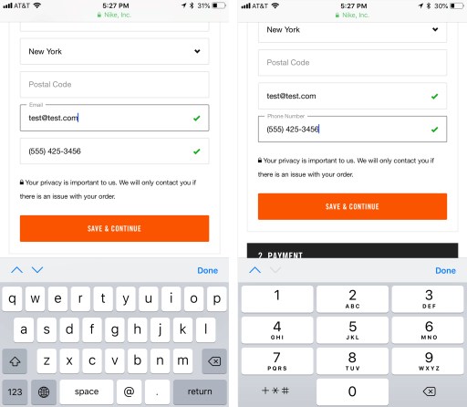
Use a numeric keypad for numerical data, such as credit card numbers or phone numbers.
For email address fields, use a keyboard optimized for entering email addresses, which includes characters like ‘@’ and ‘.’ at the forefront.
Keyboards should also include up and down arrows to facilitate quick transitions to the next (or previous) field.
- It’s the content that convinces customers that your product is what they need.
One of the biggest mistakes is starting with design.
Always start with the user or potential customer.
What are their needs?
Why should they buy your products?
Why should they buy it from you?
How can your products improve their life?
Once you understand your audience, how they perceive your site, how they evaluate and describe your products, etc., you will be able to create content (texts and images) focused on the user.
To offer a good user experience, you need to ensure that the text guides the design and convinces users to make a purchase.
- Smooth Purchase Process
The purchase process is one of the most explored parts of the user journey.
With more and more users buying on mobile, it’s essential to design a mobile payment flow that not only follows best practices for eCommerce user experience but is also optimized for the capabilities and limitations of mobile devices.
Provide quick access to the cart: when the user adds a product to the cart, be sure to show immediate feedback of the action.

In this case, a badge appears with the number of products added to the cart. By clicking the icon, the user can immediately access the cart
Make updating products in the cart as easy as possible: the user should be able to update quantities and remove products with ease.
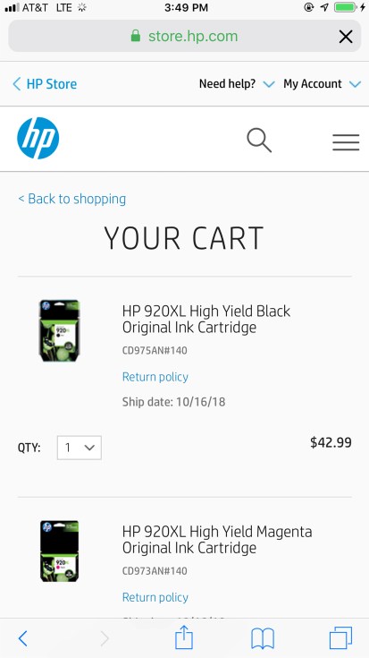
In this cart, there is no option to remove a product from the cart, which creates a block for the user and leads to cart abandonment
Ensure that the guest checkout is easy to find and clearly visible: it’s common for registered users to forget their password. To avoid cart abandonment in these cases on mobile, provide an alternative method to proceed with the purchase, such as guest checkout.
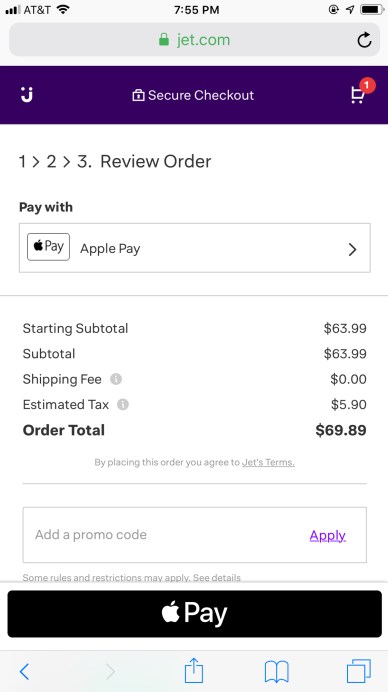
Make the order summary easy to find on mobile: while the details we display in the order summary (including subtotal, taxes, fees, discounts, and shipping costs) are important for any payment flow, we need to pay special attention to the placement of the order summary during checkout on mobile. Due to limited screen space, these additional costs might appear small on the page and could be ignored by users. Don’t make users scroll to the bottom of the page to find this information.
A perfect example of an order summary for mobile layout
Finally, offer payment options optimized for mobile devices, but don’t overwhelm users with too many choices.
Recognizable third-party payment options like PayPal or Apple Pay can be useful, but too many options can lead to choice overload.
The most common payment method should be the most prominent on the page or listed first among the other options.
It’s also important to inform users that they will be temporarily taken away from the site to enter payment details before being brought back to complete the checkout.
Clear and mobile-friendly payment options (left image). To minimize the information entered by the user, offer these options early in the checkout flow; however, be sure to repeat them on the payment page for users who may have missed them earlier (right image).
Conclusion
Every element on a page should serve a purpose to help the user take actions quickly and easily to achieve their goal. Everything else is just a distraction.
Are you looking to increase your eCommerce site’s revenue but don’t know how to apply these guidelines?
Optimize your eCommerce now and rely on our experts
Riferimenti:
https://www.nngroup.com/articles/mobile-checkout-ux/
https://baymard.com/blog/bhphoto-mobile-experience#1-allow-users-to-infer-type-of-site-from-homepage-content-42-dont
https://www.thinkwithgoogle.com/advertising-channels/mobile-marketing/what-users-want-most-from-mobile-sites-today/
https://it.shopify.com/blog/user-experience-ecommerce